
Business
How to Make Your Business Location Unforgettable
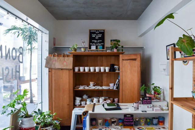
A memorable business location gives customers clear signals about who you are, what you offer and what they can expect inside. Those signals begin at the curb and continue through the entrance, service areas and checkout point. When the entire space feels consistent and easy to understand, customers are more likely to remember it, recommend it and return.
The process doesn’t require a huge renovation. Careful improvements to maintenance, signs, layout and lighting can transform how people experience your location.
First Impressions Matter Most
Customers begin forming opinions before they enter your business. They notice the condition of the building, the clarity of the entrance and the ease of finding their way from the street or parking area. Guidance on retail design impressions also highlights the value of an exterior that quickly communicates a brand’s character.
Start by viewing the property from a new customer’s perspective. Approach it from every common direction, including nearby sidewalks and parking spaces. Check whether your business name is visible, the entrance is obvious and opening hours are easy to read. If visitors frequently walk toward the wrong door, the building is giving them unclear directions.
Clean windows, trimmed plants and an unobstructed walkway show that the business pays attention to detail. Replace faded window graphics, repair damaged fixtures and remove temporary notices that are no longer relevant. These basic tasks can have as much visual impact as larger improvements.
Visitors also notice in-person business details such as staff presentation and general cleanliness. Create a short opening checklist that covers the entrance, windows, reception area and customer-facing displays. Assign responsibility for completing it before customers arrive so standards remain consistent every day.
Beyond the Front Door
The entrance should make the next step obvious. Customers shouldn’t need to stop and search for a reception desk, order counter or waiting area. Position the main point of contact within a direct line of sight or add simple directional cues where the layout makes that impossible.
Think about the transition from outside to inside. A crowded doorway creates confusion, especially when arriving customers cross paths with people who are leaving. Keep promotional displays, product baskets and furniture clear of the entrance. If customers need time to browse a menu or service list, place that information where they can read it without blocking the door.
The reception experience also shapes what clients notice during an initial visit. Train team members to acknowledge arrivals promptly, even if they’re serving someone else. A quick greeting and an estimated wait time can prevent uncertainty.
Small sensory details matter as well. Keep music at a level that allows normal conversation and choose a consistent scent, if you use one at all. Pay attention to temperature near the entrance since doors can create uncomfortable hot or cold zones. Consider how the sea breeze might affect your guests at a beachfront establishment, much like the refreshing air at Palace Playland in Old Orchard Beach.
Finally, test accessibility in practical terms. Walk the route while carrying a large bag or pushing a stroller. Confirm that doors open easily and that counters, pathways and seating allow different customers to use the space comfortably.
Strategic Use of Exterior Signage
Exterior signage should answer three questions quickly: Which business is this, what does it offer and where should customers enter? Drivers may have only a few seconds to process that information, so clean lettering and strong contrast usually work better than crowded graphics.
Check visibility at different distances and times of day. A sign that looks clear from directly across the street may disappear behind a tree when viewed from an approaching vehicle. Building shadows can also make some colors difficult to read. Take photos from likely approach points in the morning, afternoon and evening to identify weak spots.
Scale and installation require professional judgment. Businesses in Adelaide and South Australia that are comparing design, manufacturing and installation options can consult the signage company Gigantic Signs about formats such as architectural signage, pylon signs, illuminated signs and 3D letters. Before approving a concept, request a visual mockup showing how the proposed sign will appear on the actual building.
Keep the message focused. Your business name and primary service deserve the most visual weight, followed by useful details such as an entrance arrow. Phone numbers, long slogans and lists of services often become unreadable at normal viewing distances.
Review local property rules and permit requirements before production begins. You should also plan for cleaning, bulb replacement and future graphic updates. A sign can only support brand awareness when it remains clean, visible and accurate.
Creating an Inviting Interior
A memorable interior has a clear visual hierarchy. Customers should immediately understand where to look first, where to go next and how to get help. Choose one focal point near the entrance, such as a service desk, featured product display or concise welcome message. Too many competing displays make the room harder to process.
Use your brand colors with restraint. A recognizable color on feature walls, signs or furnishings can connect the interior to your website and marketing materials. Covering every surface in a bold brand color may overwhelm the space and make merchandise or information harder to see.
Layout should reflect the actions customers take during a typical visit. A salon might guide guests from reception to seating and then to service areas. A retail store may create a natural route from new products to core categories and checkout. Observe real customers for several days to see where they pause, backtrack or ask for directions. Those moments reveal where the layout needs improvement.
Comfort encourages people to stay long enough to make a decision. Provide seating where waits are common and leave enough room between displays for customers to browse without bumping into one another. Keep frequently requested items within easy reach and place staff-only materials out of sight.
Your interior should also support the expectations created by your wider brand. Advice about the brand’s first impression shows why consistency matters across customer touchpoints. Match the language, colors and service style people have already encountered online.
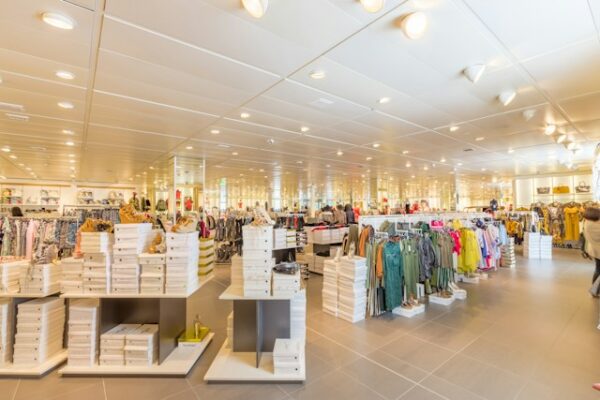
Image Credit: Unsplash
Lighting for Impact and Visibility
Lighting affects appearance, comfort and the customer’s ability to complete simple tasks. Begin with functional needs. Entrances, stairs, payment areas and directional signs require enough light for safe movement and easy reading. Product displays and consultation areas may need focused lighting that renders colors accurately.
Layering produces a more useful result than relying on one bright ceiling fixture. Ambient light provides general visibility, task lighting supports activities and accent lighting draws attention to selected features. A café might use warm ambient fixtures over seating, brighter task lighting at the counter and a focused light over the menu.
Color temperature changes the mood of a room. Warm white light can make hospitality and waiting areas feel comfortable, while neutral white light often suits offices, studios and retail displays. Avoid mixing several noticeably different temperatures in one sightline since the result can feel accidental.
Exterior lighting deserves the same care. Illuminate the entrance, business name and main pathway without creating glare for drivers, neighbors or customers. Timers and light sensors can keep the property visible during operating hours without leaving every fixture on all night.
Schedule a lighting review after sunset at least twice a year. Seasonal changes, plant growth and failed lamps can alter visibility gradually. During the review, look for dark patches, reflections on windows and signs that disappear against bright backgrounds. Replace lamps in matching groups when possible so their color and brightness remain consistent.
A business becomes easier to remember when customers never have to guess where they are, where to enter or what to do next. Stand across the street after dark, then walk through the entire customer route. The spots that cause hesitation will show you exactly where your next improvement belongs.